Acupuncture can provide constipation relief while maintaining a healthy pregnancy. A combination of San Jiao 6 (Zhi Gou) and Stomach 36 (Zu San Li) is excellent for treating constipation during pregnancy. San Jiao 6 is the shu-stream and fire point of the San Jiao channel. It can regulate the qi of the three jiaos, unblock the qi of the fu organs, descend counterflow fire, open the orifices, activate the collaterals to disperse stagnation, and eliminate distention to stop pain.
Using Synergy for Healing Spaces
Ever since seeing my first martial arts movies as a kid, I've always been fascinated by them. As an architecture student at the University of Arizona in the '80s, I finally got to experience martial arts classes. What started off as a physical and self-defense pursuit slowly evolved and the doorway to the spiritual started to open for me. After class I felt completely calm, grounded, peaceful, connected to life and happy.
Heading back to my architecture studies made me think, "If the ritual of practicing moving meditation can make me feel these good feelings, how might the experience of architectural environments bring these same feelings to those who experience it?" For the rest of my career going forward, I would continue to pursue this study.
For my senior thesis, I designed an Olympic martial arts training facility. The design of the facility's environment paralleled the ritual of the martial arts practitioner: leaving one's daily life to transition into a mind space of focusing on one's art form, enabling this transcendence from the physical into the spiritual experience.
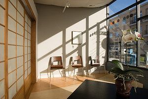
It's not every day I have a client asking me to design their space to help them achieve this, with the exception of the few acupuncture clients I've been fortunate to work with. I met Jennifer Paschaen at a school event, as our children were in the same class at the Chicago Waldorf School. Jenn was ready to open her own practice focused on women and reproductive support, and was looking for an architect to design the interior alteration of a space she was considering in the Lincoln Square neighborhood of Chicago.
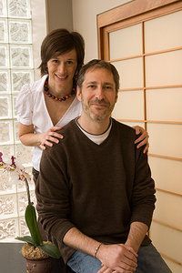
One of the first things I immediately picked up on in our conversations for the goals and intentions of her new space was that for the first time, I had a client who was using the same vocabulary as I had been using in my martial arts world: themes of the flow of energy, centering, groundedness, meditation, and a connection to nature. I didn't need to "hide" these terms, even though I would use them in my design work for my other clients. This was really exciting for me, and I felt I'd finally found "my people."
One of my heroes I discovered in college was the brilliant inventor Buckminster Fuller, who was known for his concept of "synergy," which is how the effect of the parts acting as a "whole" is much greater than the parts as individual pieces. If the experience of Jenn's architectural space could assist the work she is doing with her clients, then the synergy of space and treatment would be much greater in effect to the client. This notion would be the foundation for our decision-making in designing the elements that would make up her interior alteration.
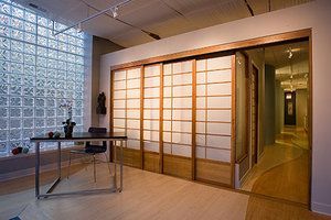
As soon as a client comes through the entry door, off a busy street and next to the sounds of Chicago's mass transit brown line, once the door closes, they feel they are in a safe, quiet and calm environment. Visitors are greeted with a series of sliding shoji panels, which have beautiful cherry wood frames and soft rice-paper panels. There is a kind of calming order to seeing all four of them shoulder to shoulder.
When the office is closed, we have these illuminated, so neighbors walking by also experience their calming effect when looking in, and subconsciously they know this is a place of peace and healing. Free advertising 24/7.
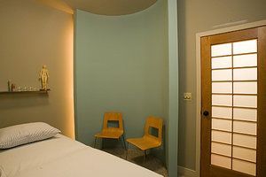
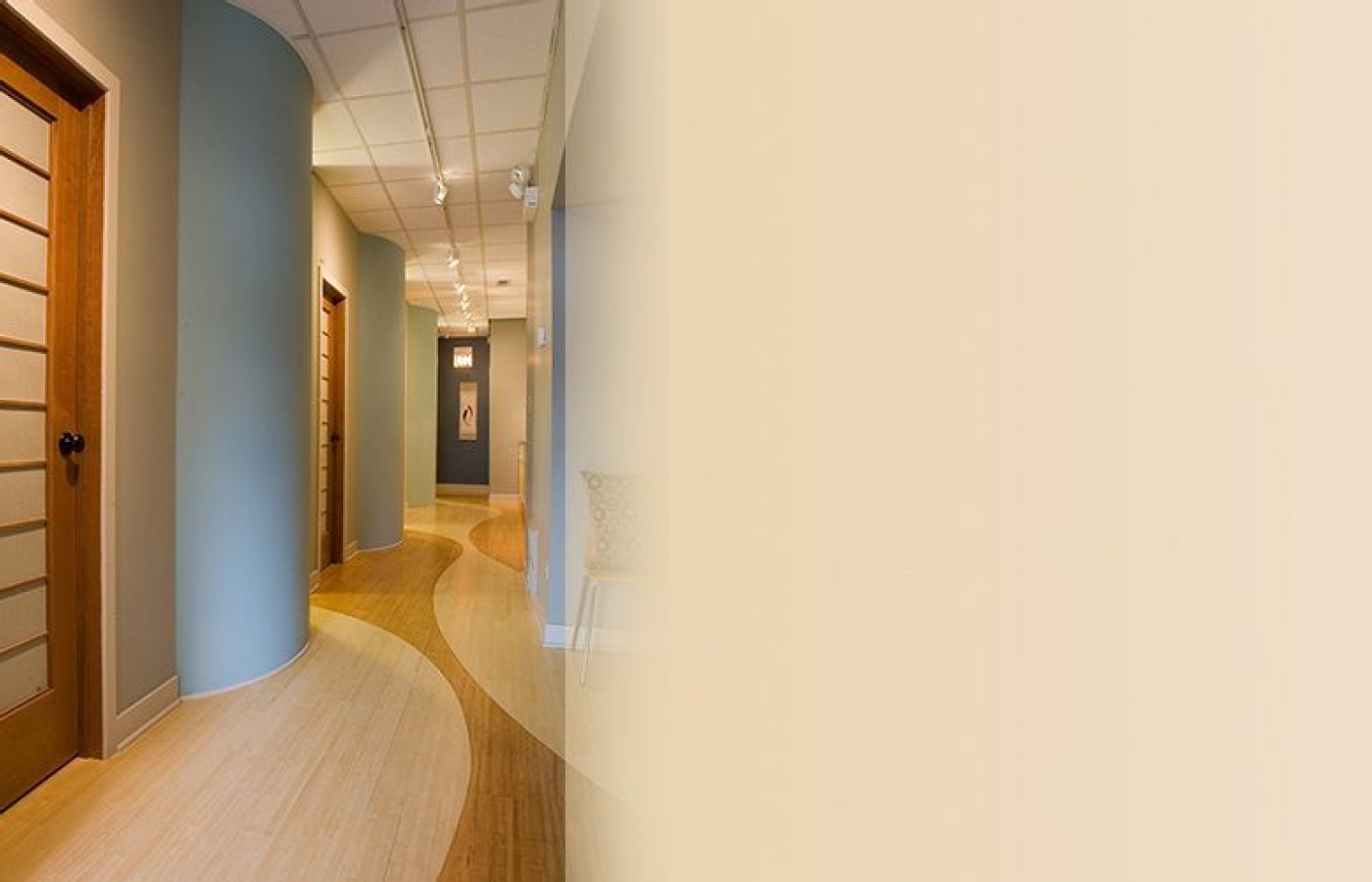
Being a fan of acupuncture myself, I am aware of how the practitioner is using the tools of acupuncture to help open restrictions of energy flow found in the body. Therefore, I felt my main goal was to design the space to show clients how the flow of energy was coming into the clinic, through the hallway, into their private treatment room and surrounding their treatment table. I achieved this in several ways. First one notices the beautiful bamboo hardwood floors we used have two tones. We used a router to carve a 1/8" groove in the floor to make a series of flowing curves. The groove allowed us to stop the floor stain color cleanly along the curve, rather than cutting curved, pre-stained woods, and saved Jenn a bunch of money.
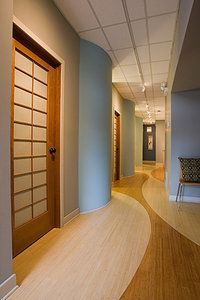
This flows into the walls of the corridor leading to the treatment rooms. They have curves that go from the corridor and flow into each treatment room. We used hidden, indirect lighting to highlight the curves – and as a metaphor for the energy flow through the center. The curved wall focuses attention to the treatment table and acts as a safe place for the pre-treatment meeting between practitioner and client. We placed seating on the inner curve of the wall for this safe haven.
I always loved the state of being I found myself in when my treatments were over. I was always tinging feeling the newly opened ki pathways working well again. I supported this notion by installing a fiber-optic lighting element behind the ceiling. Just the ends of the fiber-optic strands are pocked through the drywall. The light slowly dims and illuminates these ends, so the effect is like a twinkling night sky in the desert, alive with life energy.
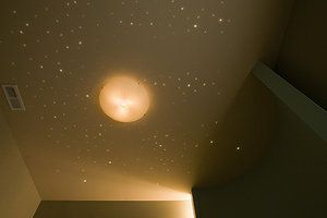
Jenn turns this on a few minutes before the treatment ends, so as you open your eyes, the room is alive with energy, similar to what one is experiencing in their body.
When the design of a center's architectural elements and experience are parallel to the intentions of the practice, you create a powerful synergy much greater in effect than the sum of these parts by themselves. You clients and staff will certainly "know" this beneficial difference.
Editor's Note: All photos appear in this article with permission from Scott Shigley (www.shigleyphoto.com).
